
PlayStation Social
Timeframe: 2 weeks
The already existing PlayStation App allows users to keep up with the latest video-gaming activities of their friends and the PlayStation community by adding text statuses on the go. Recognizing the need for more interactive features in the existing PlayStation App ecosystem, I redesigned the PlayStation App.
Project Challenges
PlayStation has had success with its app, but to continue to grow the network, it must create an environment that is more user-friendly, promotes more social connectivity amongst users, and ultimately increases overall hours spent gaming. The main challenges for this project are:
Keeping users updated on friends’ activities in real time with video clips and other media as opposed to simple status updates
Enabling users to post in-game highlights or achievements and interact with friends
Integrating new features with the existing application and making the experience cohesive with users’ current gaming habits
Roles and Responsibilities
Although this project was a restructuring of an existing app, the new features require a complete user experience development process. As the sole designer for this redesign, I had the responsibility of handling all of the elements of the user experience, including:
User Research
Journey Mapping
Wireframing
Screen Flows
Visual Design
Design Process
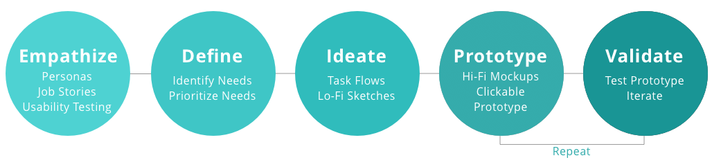
I chose to follow IDEO’s Human Centered Design Process to ensure that my design decisions were deeply rooted in user research and feedback. My goal was to empathize with the end-users of the app. Being that this redesign project is based on implementing new features, the most important aspect of my design process was to understand the behaviors of existing users.
Understanding the Users
I conducted 8 remote 1:1 interviews with users in the targeted demographic to better understand their habits when using the PlayStation app.
Based on my research, I realized that most users only use the app to browse the PlayStation store, redeem codes, and manage downloads remotely. This confirmed that although the app has features for social connectivity, most users are choosing not to engage with them or are unaware that they exist altogether.
My key findings from user research:
Most users are open to having more sharing options in terms of gameplay with their friends
Most users agree that they do not understand the core purpose of the PlayStation app
Most users say they believe they would use the app more if the process of sharing images/videos from the console was more fluid
Based on my research findings, I realized that people playing on the PlayStation console already use the “Share” feature to capture images and videos of their gameplay but rarely share it anywhere. These users were very open to sharing their experiences with others in the same way they share other parts of their lives on other social media apps
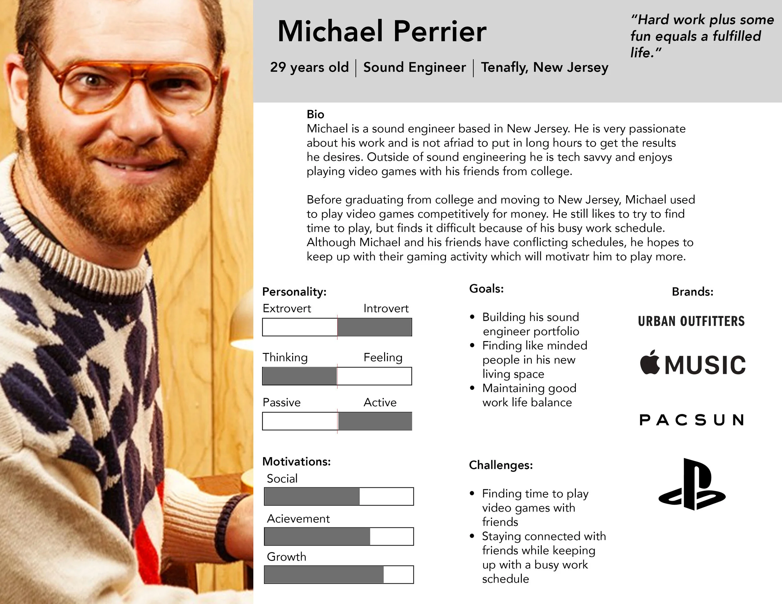
Based on this information, I created a persona for reference in the design process to ensure user empathy remained the core focus.
User Map
With the persona in mind, mapping the basic flow of the app made me think deeper into each step that the user would take to get to the multiple solutions I wanted to create. In the user map, each of the crucial user flows, from creating and storing content on the console to uploading and sharing the content on the PlayStation Social App, show the user-friendly navigation system. Each step of the way, I considered the user mental models to help ensure that my initial design ideas would be smooth and intuitive in the final iteration of the product.

Wireframes
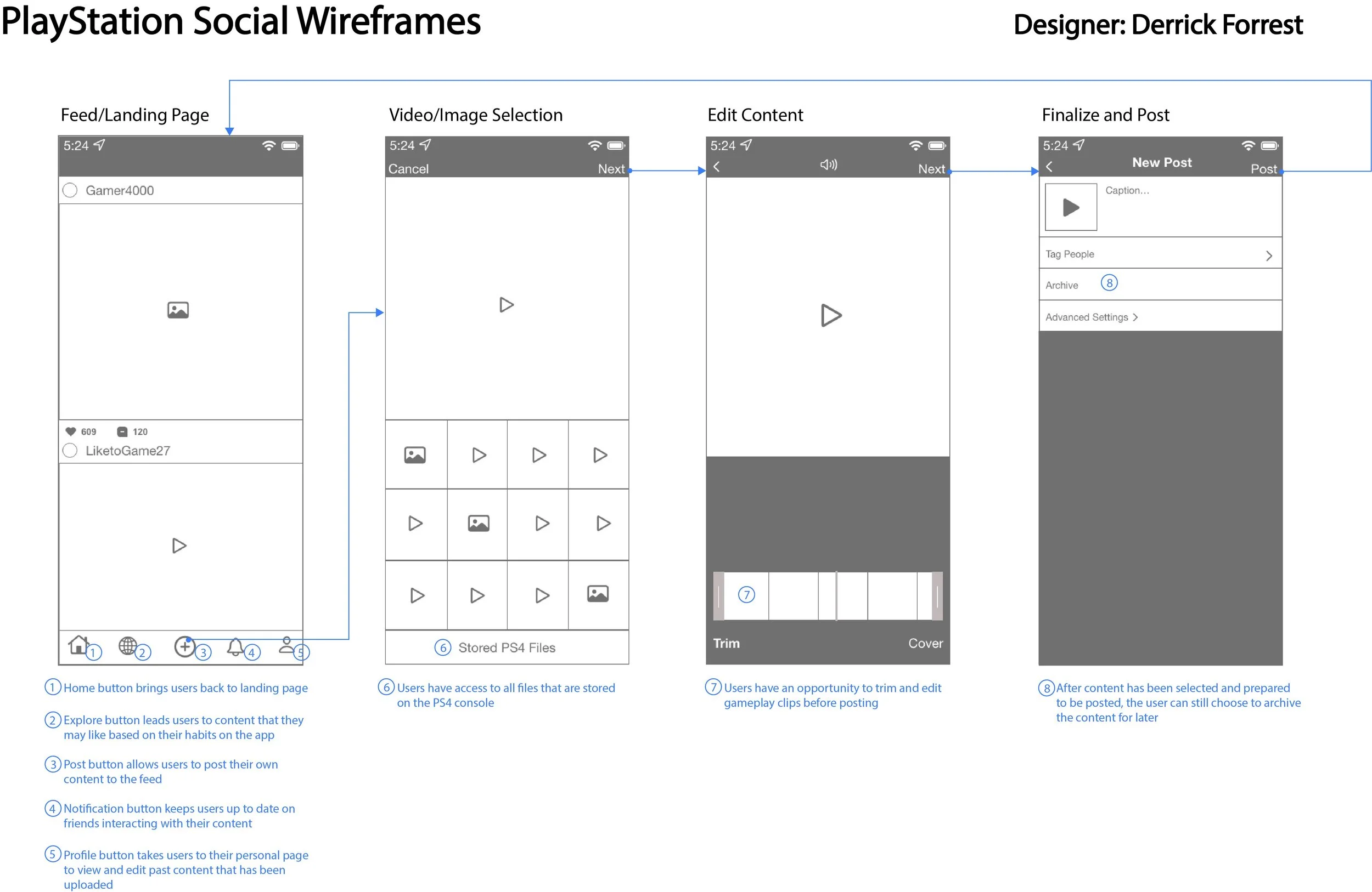
After getting a good understanding of the user flow, I wanted to get a visual idea of what some of these paths would like on user screens. At this point, the visual design wasn’t the focus. The focus was the shell of the interface and the interactions the user would have to take to transition smoothly. The simplicity of the wireframes allowed me to compare different versions of each idea before the intricate design process. Below, is an example of this process through the lens of the user posting gameplay clips on their feed.
Defining the UI
Because this was a redesign, a mood board was especially important for this project. Although I wanted to update the UI of the app, I also wanted to keep the aesthetic and feel of the original PlayStation app. I gathered inspiration from existing PlayStation products and other interface elements that made the UI feel cohesive.

Posting Details
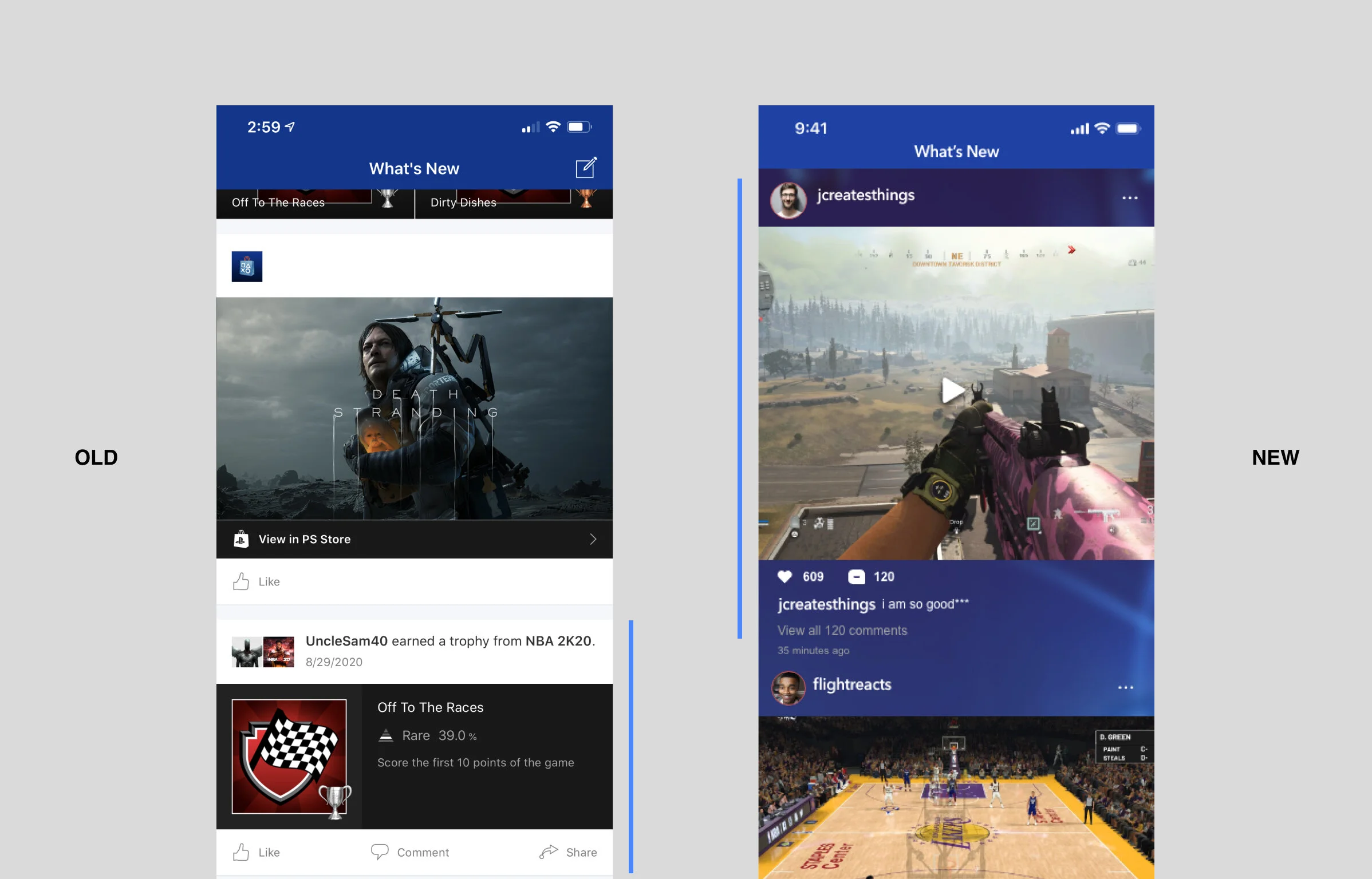
Because the main focus of this redesign was to allow the user to engage more fluidly on the social media aspect of the app, the home screen feed was important. Since a common theme among users was wanting the ability to share gameplay clips with friends, I highlighted the activity container by making it slightly bigger than it’s original size.
Final Screens
With the focus of the redesign being the user-friendly social media features, I decided to build the aesthetic around the conventional social media app interface. While this was important, it was also equally important to maintain a level of cohesiveness throughout the app. I needed PlayStation gamers to feel like they were using something new, but still give them a level of familiarity. Therefore, I used staple colors and styles from the PlayStation console interface with minimal adjustments to keep it fresh.

Results and Next Steps
Here are a few key takeaways from working as the sole UX designer of this redesign project:
Usability Testing is valuable at any stage.
In the future and with more time, I plan to resume this case study for further discoveries by conducting usability testing. While my user interviews were valuable, getting feedback on the actual designs or conducting contextual inquiries with a prototype would have been great for solidifying a concrete direction.
When dealing with a product with heritage, convention is key.
While some designers may be opposed to this idea, when working on a redesign of this nature, I believe that sticking to what has worked as much as possible is the best way for quantifiable results. From my user interviews, I got a lot of mixed messages about what the users really wanted. If I took all the responses too literally, I could have ended up with a product that is so different from the original it no longer encompasses the brand identity. I’m always going to trust user feedback, but going forward, I will ask why they “need” what they say they do.
Thank you for reading my case study!