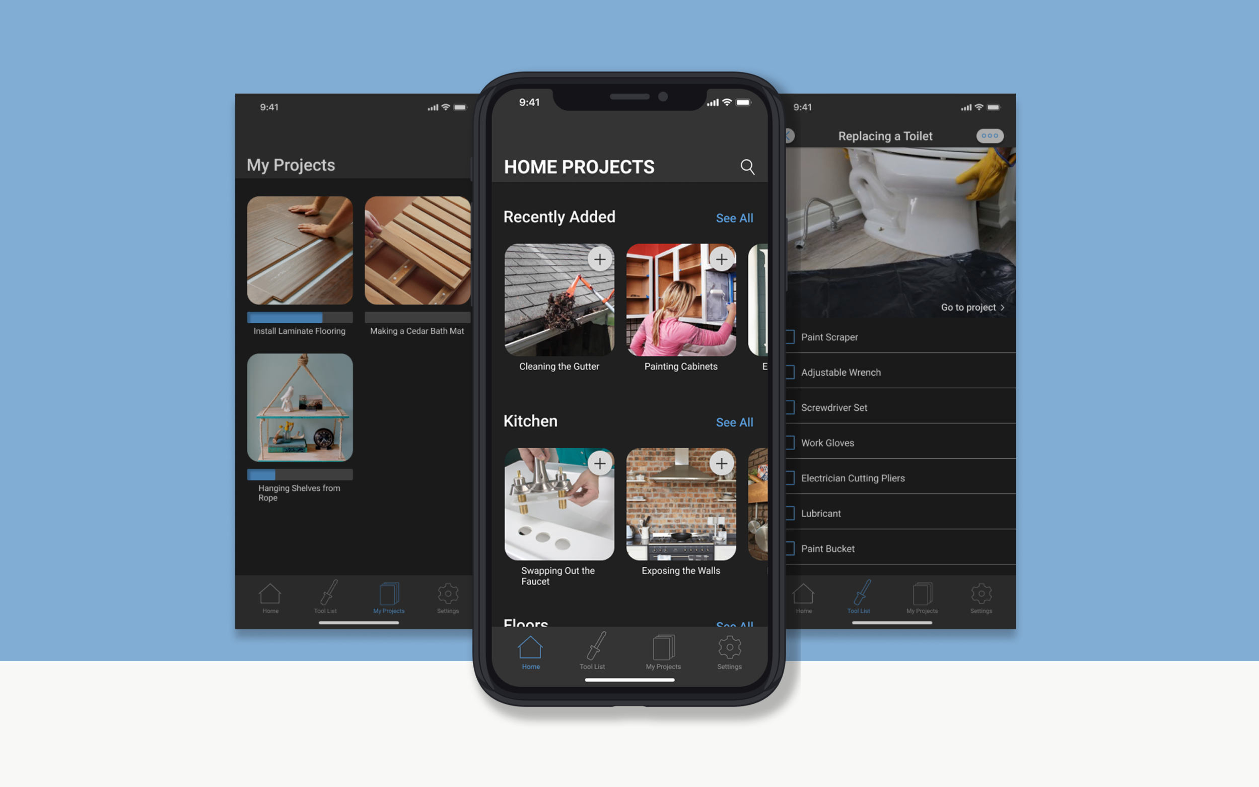
Home Projects
Home Projects serves as a hub that provides users with the tools, tips and guidance necessary to complete home improvement projects. This project was an exploration of how I might give users centralized access to information they would normally need to research for their own DIY project.

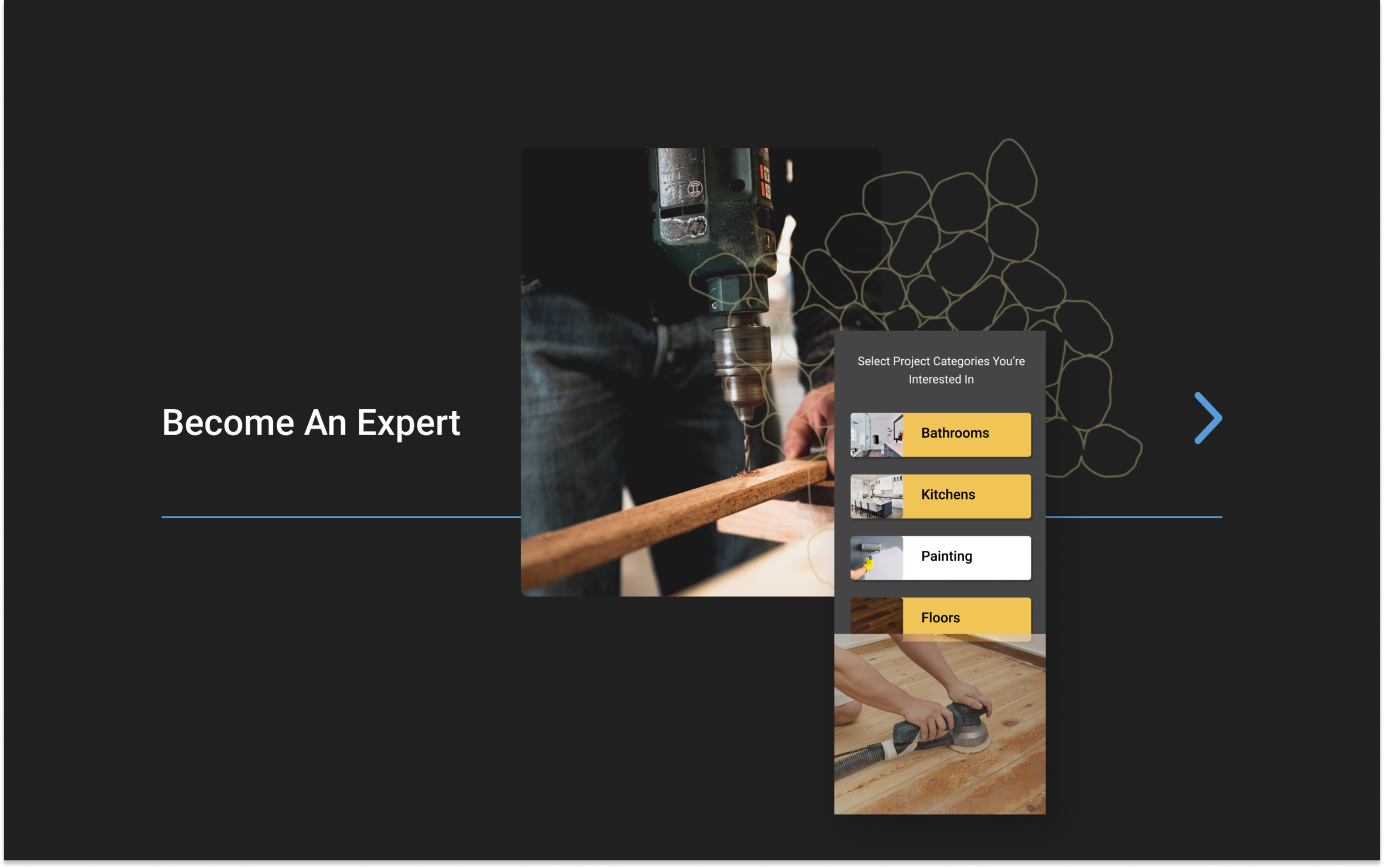
Get Started Find a project and take a glance at the steps. Step-by-step walk throughs, shopping lists, and video tutorials are waiting at your fingertips.
Shop Efficiently With the Tool List feature, you can get a shopping list at the press of a button, and make that trip to the store way easier.

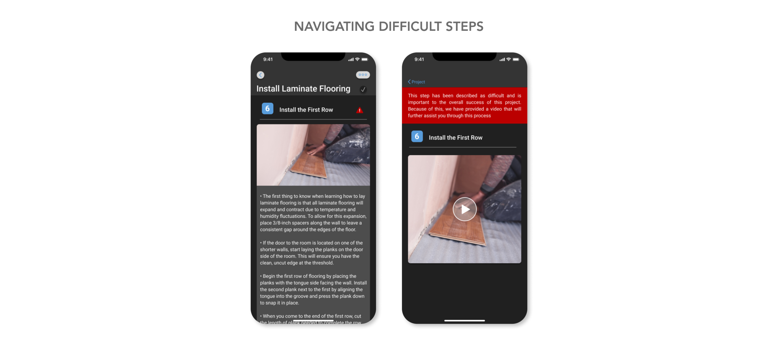
Be Supported Difficult steps are highlighted and offer extra assistance through detailed tutorial videos.

Early Feedback
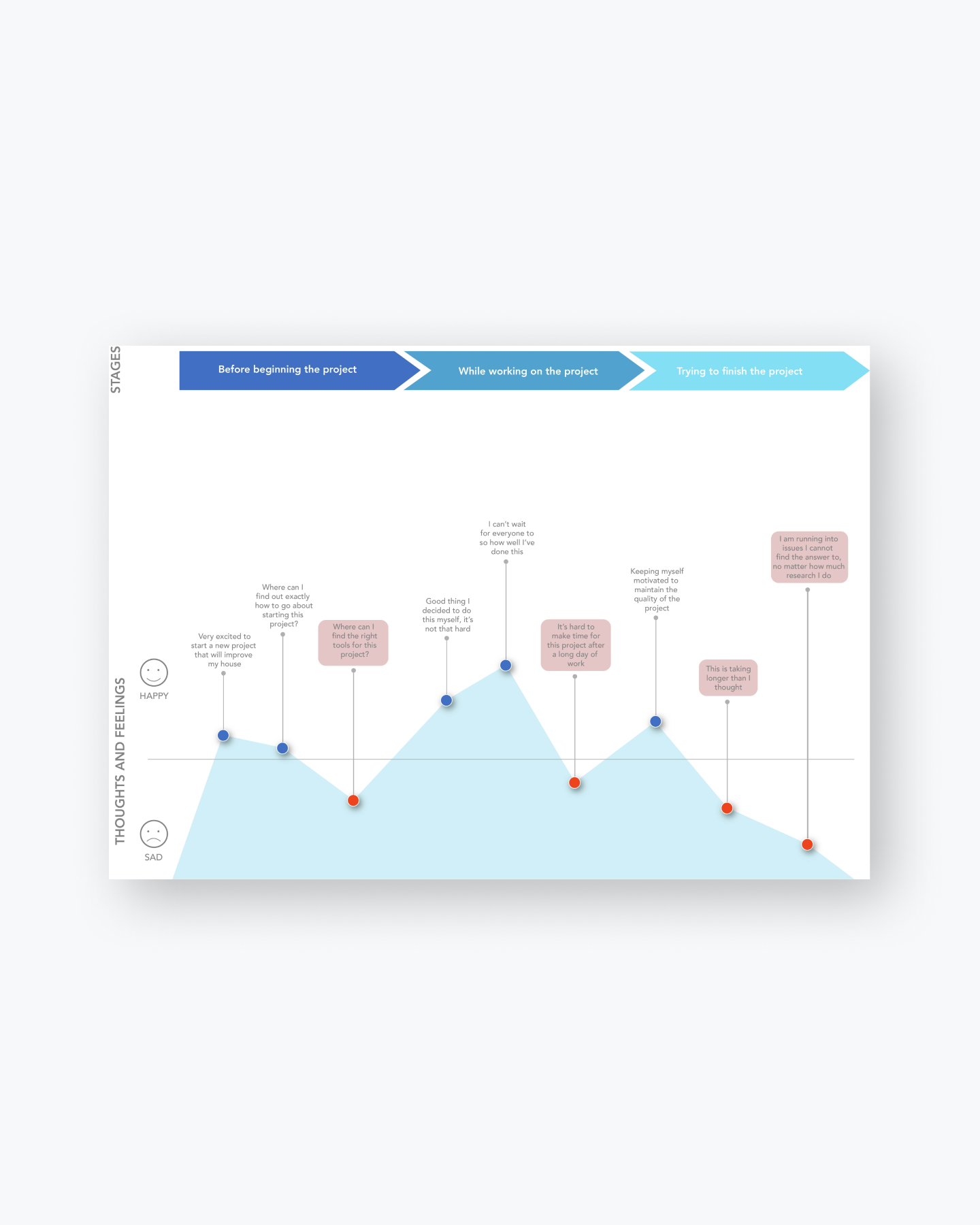
User Journey
Research
I used User interviews and competitive research. Taking the time to learn about potential users and where they look for relevant information revealed important insights that later contributed to design decisions.
Problem: With an overload of content available to us at all times, it can be difficult to decipher what information will offer the most help. To further complicate things, researching the required materials/tools for a project and the how-to instructions take up a huge chunk of time that people need to actually work on the project.
Solution: A mobile app that empowers users by providing personalized project recommendations, automated shopping lists, and a system that helps keep track of on-going projects at a glance.
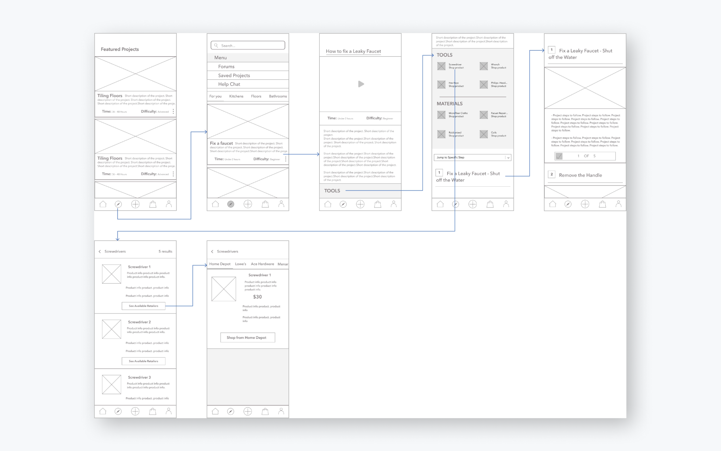
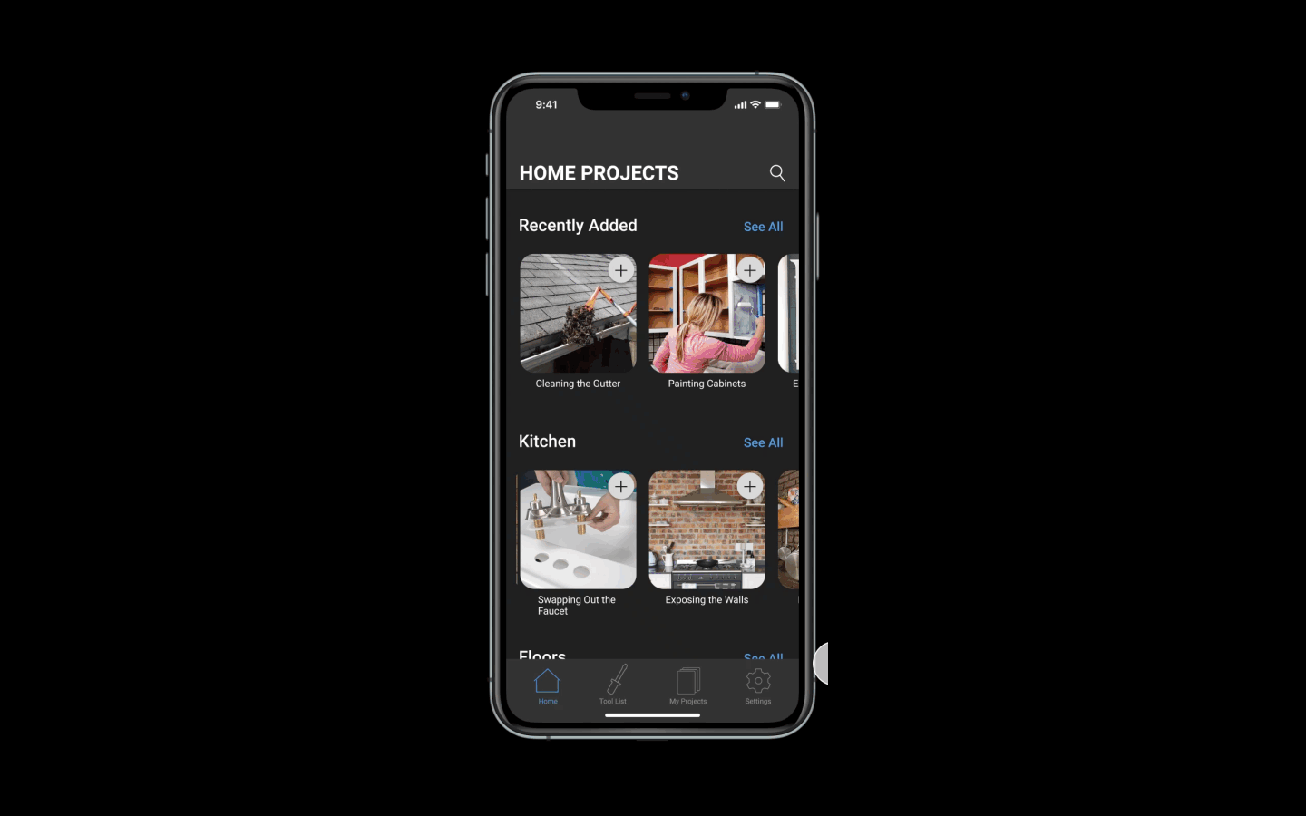
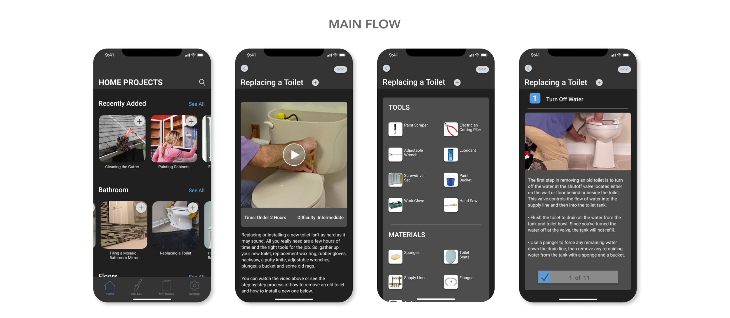
The wireframes here display the user flow journey of finding a project, looking through how-to steps, and being directed to necessary tools for the projects.
Feedback and Structure Iterations
To test my design assumptions, I moderated user testing sessions on the app layout. I used 4 users with different perspectives on app usage and levels of knowledge on home improvement projects.
To organize user feedback, I grouped my results by themes and features so it would be easier to correlate them to a precise design solution.
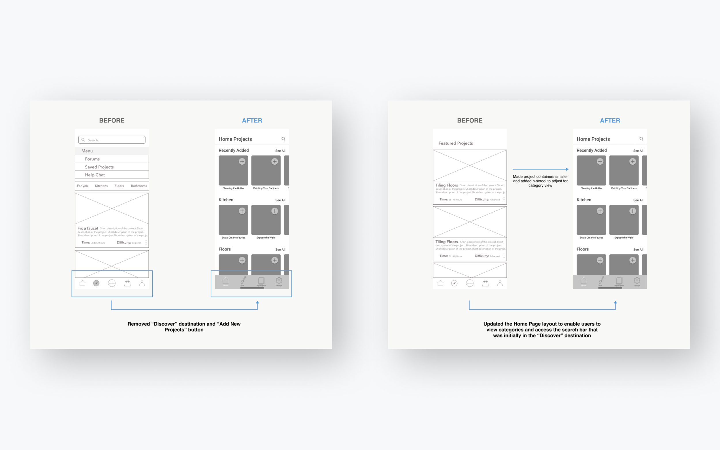
Bottom Navigation While users understood the purpose of the “Add New Projects” button, after testing, I realized that most did not have to engage with it to reach their end goals.
Because the results showed that this button was not a necessary feature, I moved the “Add New Projects” button to a top level destination.
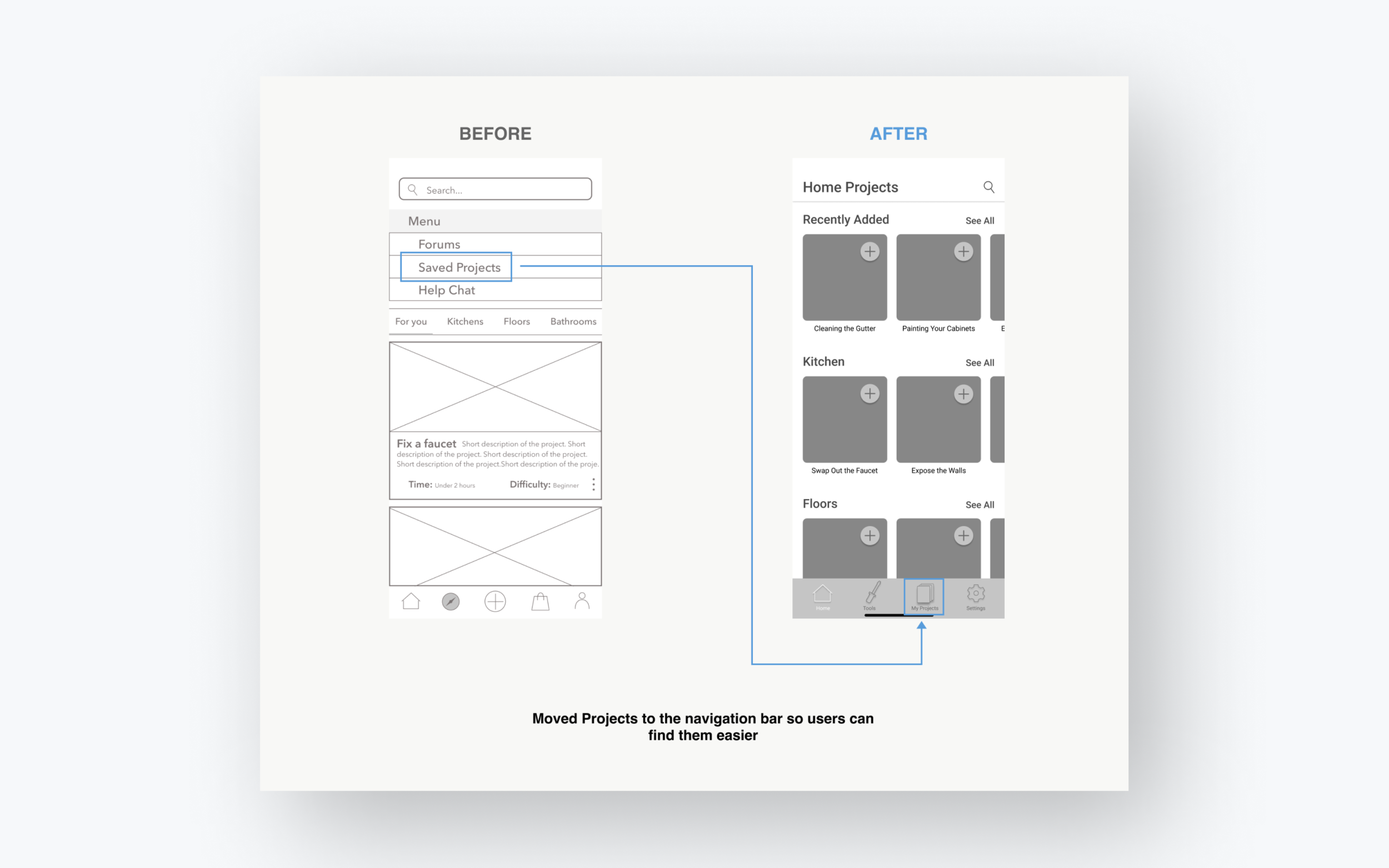
Users also found difficulty remembering that their saved projects were in the menu under the “Discover” destination. Therefore, I made the decision to add the “My Projects” button into the bottom navigation bar.
Since keeping track of ongoing projects was a main product feature, I did not want to risk any chances of low accessibility.

For the My Projects page, my initial intention was to provide users with the name and photo of each project they were actively working on. However, after testing, I discovered that users also wanted the ability to view their progression on current projects.
The initial design required users to click on the project container and then scroll to see where they left off. To provide this information at a higher level, I added a progress bar to the projects on the My Projects page to provide users with the quick reminder they were looking for.

When it came to shopping for tools and materials through the app, users explained that while the feature was useful, there was an overload of information regarding different purchasing options.
To iterate based on that feedback, I scaled back the content and features for the shopping page to only provide an image of the tool, a short description, and a CTA button to shop.
A subtle dark layout was used to give a sense of seriousness for the art direction. The goal was to make users feel the quality of the information they receive from the product.
Next Steps
What did I learn?
Designing the Home Projects app has been a challenging and rewarding journey. From the early research and user interviews phase, it was clear the major challenge would be getting users to engage with a product that competes with their norm of googling or looking up an answer on the internet.
I researched various DIY projects, the tools necessary for these projects, and the normal habits of a user completing a DIY project. I gained an understanding of user needs through internet research, user interviews, casual conversations, and competitive research.
What are the next steps?
Detailed research for more feature implementation
User testing the prototype to refine the design further
Improving user interactions through iteration